Brisbane Roar are no longer A-League fashion victims and neither are their fans.
Once upon a time, at what would turn out to be the high-point of my remarkably unsuccessful youth career, I was coached by a burly Eastern European who had a strange fixation with football kits. His mantra, delivered in somewhat broken English was, “You looking good, you feeling good. And then you feeling good, you playing good.”
To this end, he insisted his players keep their shirts tucked in to their shorts at all times on the field. Any violation of his Draconian dress-code would see a player instantly substituted, chided and then sent to run laps of the field until the full-time whistle as penance.
Despite his assertions though, this pathological preoccupation with our shirt tails resulted in little success on the pitch. The team’s only honour for the season being an unwanted reputation as the dorkiest looking wooden-spooners in all of Brisbane.
Now, I recount this tale of teenage trauma not as therapy (although talking about it does help) but as an example of many football folk’s obsession with kits – something A-League supporters, as followers of a still maturing league in a country with a notorious cultural cringe, seem particularly susceptible to.
For some reason, and much to the bemusement of the supporters of rival codes, we A-League fans feel compelled to critique the kits of all the teams in our league. I know this bemuses NRL and AFL supporters because they have told me so.
Brisbane Roar supporters in particular have felt the ire of rival fans over the past six seasons as terms like retina-searing, migraine-inducing and stomach-churning have been employed to describe our club’s garish use of orange.
It is criticism that confuses your humble blogger since other orange-clad football teams – for example Blackpool, Houston Dynamo, Shimizu S-Pulse and, most famously, the Dutch national team - don’t seem to receive the same level of criticism for their orange kits in their home countries.
So I decided to put a few people of varying expertise both on the spot and on the record, asking them precisely what it was about Roar kits past that so raised their ire and to see if the new Puma kits unveiled last week were an improvement.
The Fashionista
Alyssa Creighton, 21, is the sort of young lady that turns heads whenever she enters a room. Possessing a startling combination of bone structure, poise and style, she would not look out of place hanging off the arm of a champion European footballer arriving at the Ballon d'Or.
Now, if you’re thinking I asked her opinion simply so I could be seen in the company of someone completely out of my league, you would be absolutely correct. In football terms she is quite clearly Premiership material while I’m well and truly stuck in a League One relegation battle.
And while Alyssa openly admits to knowing nothing about football, she does know an awful lot about looking stylish – having formally studied beauty therapy and make-up artistry in addition to being a life-long student of everything that is fashionable.
Unsurprisingly, her opinion of previous Roar kits was for the most part negative – especially the home versions. “I just don’t think orange and maroon go together. They clash but not in a good way. And I definitely don’t like the orange socks.”
When I reminded her orange was our team’s primary colour and for the most part non-negotiable, “Well, in that case, you can’t have maroon as well as orange. You’ve got to have one or the other.”
Needless to say then, upon being shown this season’s designs, her response was markedly different. “Ooooo,” she cooed enthusiastically, “I like those ones!”
“The black one is the best. I like the simplicity of the white and black combined with the orange. I mean, visually, it’s just cleaner.”
Her only criticism was that there were too many logos cluttering the design – the necessity of sponsors receiving value for money being something she didn’t quite grasp.
And I didn’t quite have the heart to tell her there were more sponsors yet to be added.
The Hater
Everybody knows a hater. Someone that takes the role of devil’s advocate to a level that would make Lucifer himself go, “Whoa dude, that’s just going too far.”
Well, your humble blogger unearthed a Roar hater of truly scornful proportions in Sydney FC supporter Manju Gopal, 31.
Without provocation he commenced our chat by hating on Roary the lion mascot, labelling him “feminine” despite his mane quite clearly announcing to the world he was a male lion of quite fearsome virility.
Manju then continued right on hating as we turned to the business at hand, starting with the kits of old, “They were just horrendous. I don’t think I can be more scathing enough of them.”
He continued, “I really don’t understand why the maroon had to be there at all. They say it represents Queensland but I don’t see why the Roar had to use it. If they wanted something local, maybe the away kit could’ve been a dirty brown colour – you know, like their river.”
He didn’t appreciate the new colours and design on the Puma kits either, “They look like the Wests Tigers’ poor cousin. Those mismatched socks don’t do it for me either.”
Finally, in frustration, I asked if there was anything at all he liked about them, “While it’s probably the best kit they’ve ever had it still seem like they are trying way too hard.”
At this point I rolled my eyes and gave up trying to coax a positive comment. As they say, you can tell a person from Sydney…but you can’t tell them much.
The Fanatics
A love of a football team is often passed from father to son, so your humble blogger decided he would hunt down a father and son team to get the fan’s perspective on the kits.
Andy Chopper, 35, is a thrash/punk/metal musician of some notoriety in Brisbane’s underground music scene, while his son Jackson is six and likes playing with Lego while watching the DVD of last season’s grand final over and over again.
Both regularly attend Roar home games and proudly wear their club colours while doing so, little Jackson’s supporter shirt bearing an enviable number of signatures from players past and present.
Chopper, as he is known in the scene, told me he was never a fan of the original kit, “I didn’t think much of the blue back then and I still don’t. That’s probably surprising since I am also a Chelsea supporter.”
Both were in agreement that maroon should be on the Roar kit in some form though. As Jackson shrilly shouted in my ear during our interview, “Because it’s the colour of Queensland!”
The absence of maroon didn’t prove ruinous to the new kits for either though, both quite excited by their first look at the new designs.
Chopper made reference to his musical roots, “Obviously I’m a big fan of black so I quite like the away kit. But other than that it just looks more professional – more European or maybe South American. A real football kit.”
Jackson, as precocious kids always manage, had the last word though, “I don’t care what they wear. I just like Brisbane Roar.”
Out of the mouths of babes, indeed.
The Blogger
As for myself, well I’m delighted with the new kits if only because by removing the maroon some of the constant criticism of the past six years will finally come to an end.
I was lucky enough to be at the kit launch last week and I can assure you that up close they look striking while the players assured me they felt great as well. Even Roary, who has also received a new kit for the upcoming campaign, gave me two thumbs up and a big nod of the head when I asked him his opinion.
My only regret is that I didn’t get to track down my old coach and bring him along to the launch. I would’ve enjoyed pointing out that Erik Paartalu, the scorer of the Grand Final saving goal, and Michael Theoklitos, the hero of the subsequent penalty shoot-out, didn’t have their shirts tucked in.
Then I would’ve told the mean old bastard to go run laps himself – or words to that effect anyway.
Related Articles
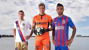
Newcastle Jets release AFC Champions League kits ahead of massive knockout tie
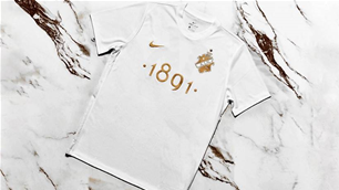
Fulham celebrate 140 years with limited-edition vintage kit