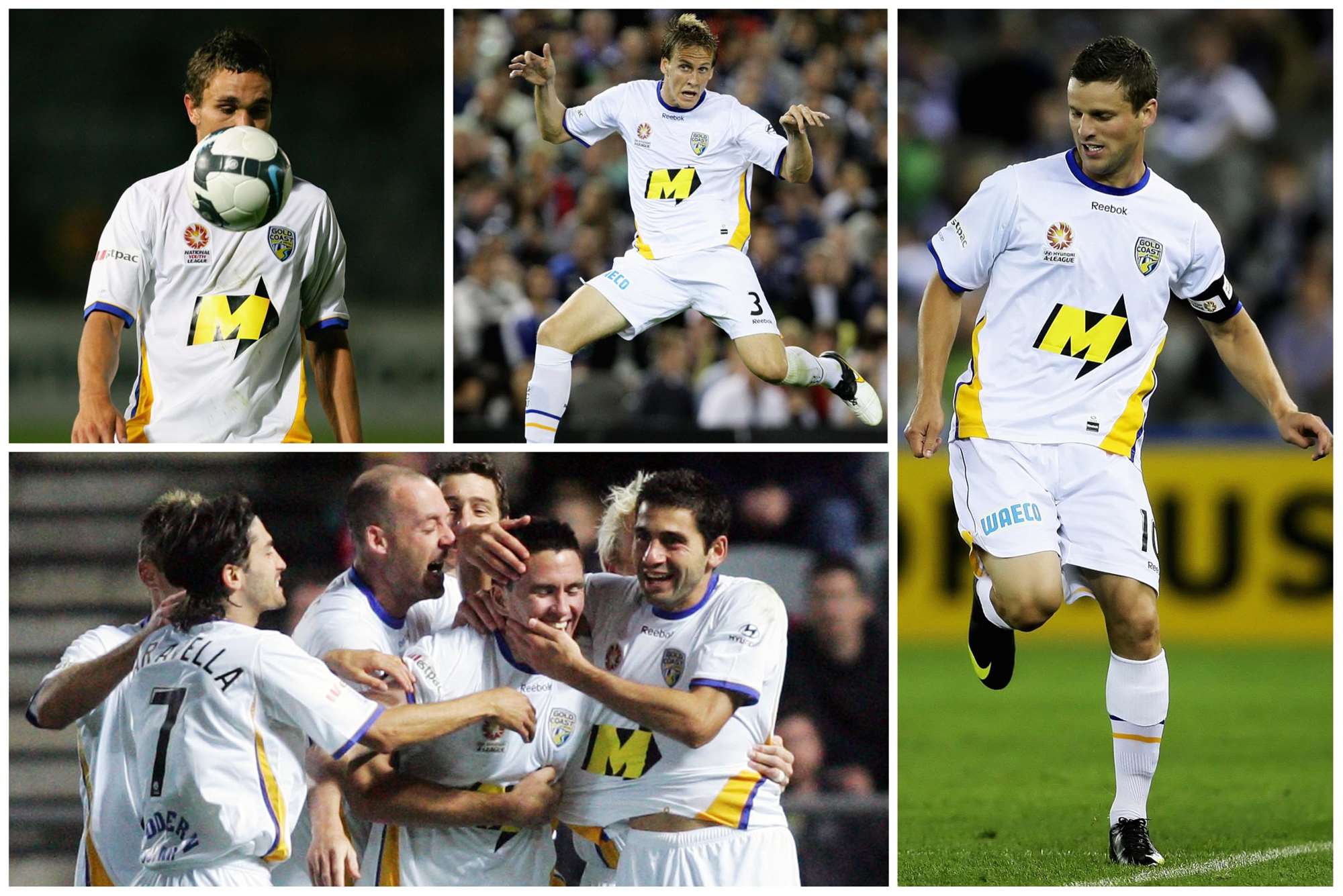
10: Gold Coast away (season 4)
A dash of gold and blue trim on a white kit worked beautifully well. Unlike the club.
2 / 10
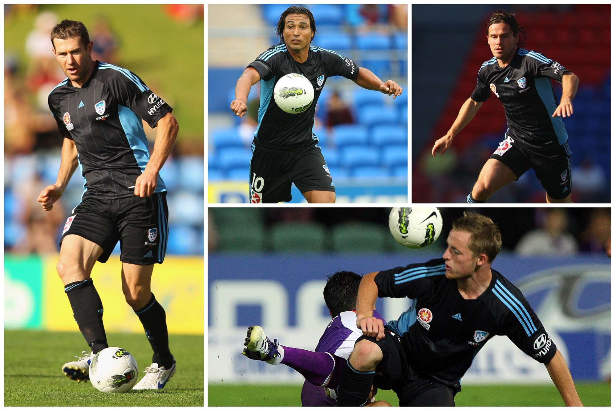
9: Sydney FC (away season 7)
With kits, less is more: understated colours with fewer sponsors logos often work better. Sydney’s uber-cool black away kit with sky blue trim is a prime example.
3 / 10
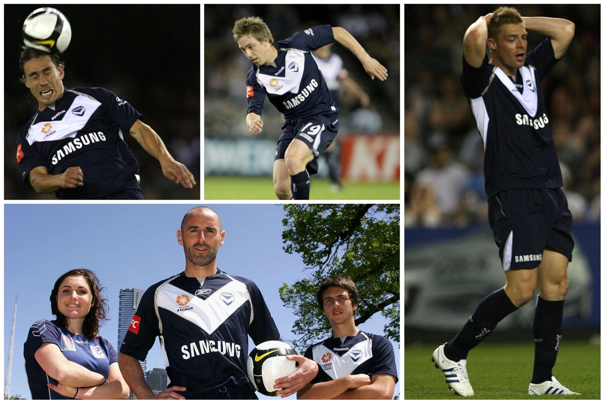
8: Melbourne Victory (home season 3)
After a fairly dull first few seasons, the Big V design was introduced as part of the home kit after it featured on the grey away jersey in season 2 – and the distinctive design continues to this day.
4 / 10
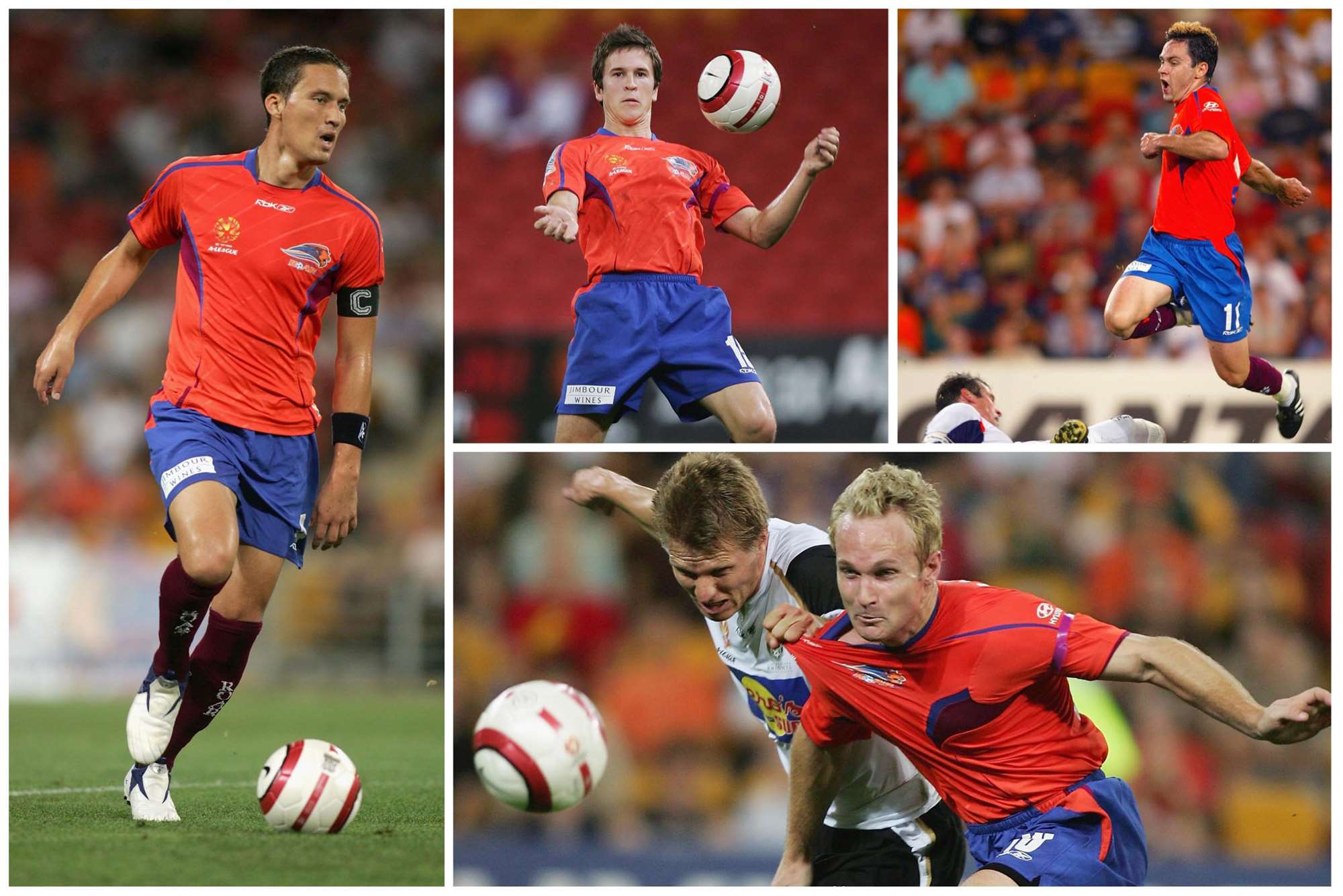
7: Queensland Roar (home season 1)
Orange shirt, blue shorts and maroon socks. Chad Gibson was all over this. We're tipping this season's stunning Roar third kit to feature in future classic kit lists though...
5 / 10
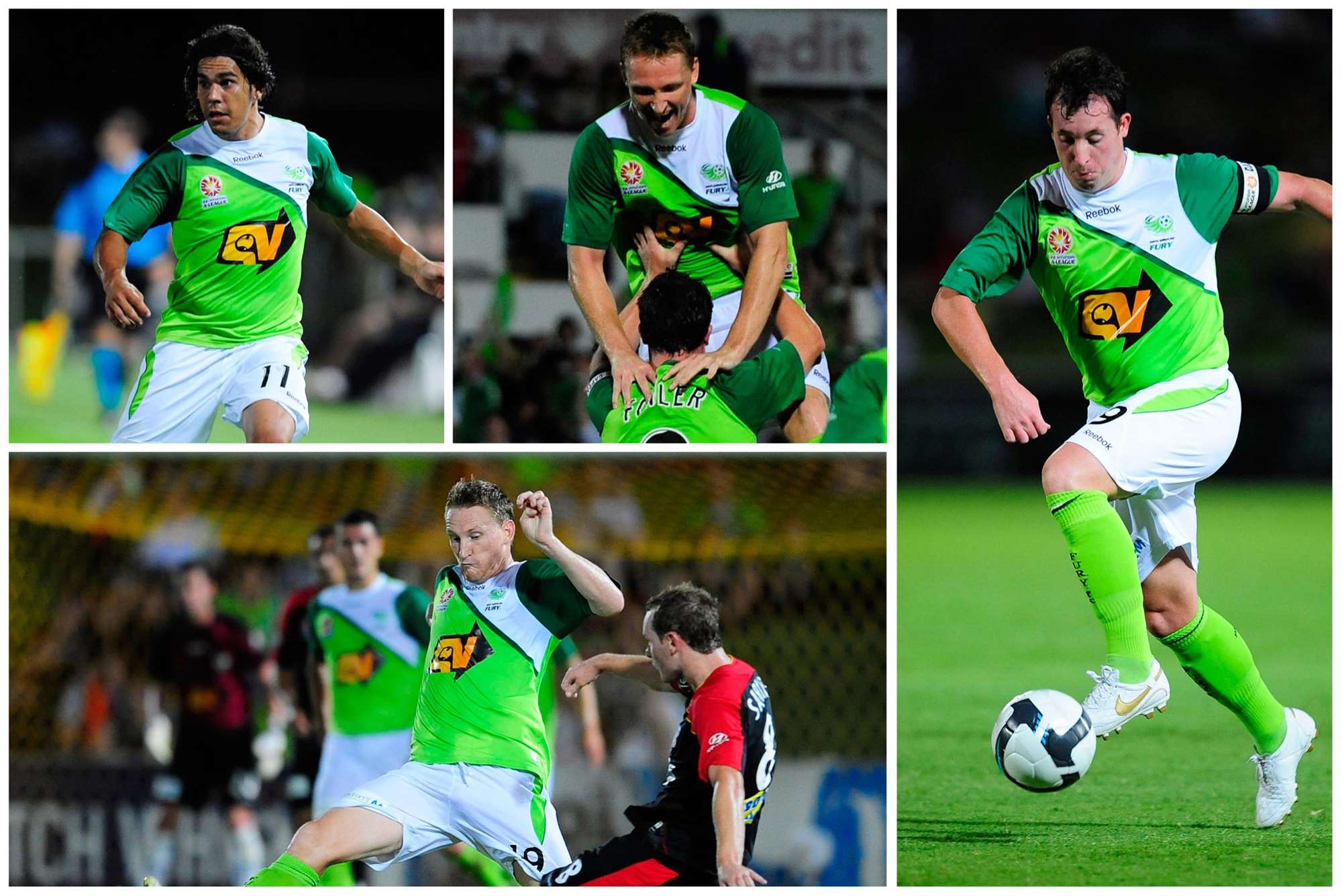
6: North Queensland Fury (season 4-)
Green doesn’t often get a gig in the A-League especially when it was lime green and dark green combined - and it's fair to say opinions were divided on it, not least in FourFourTwo HQ. But the Townsville club pulled it off - till the plug was pulled.
6 / 10
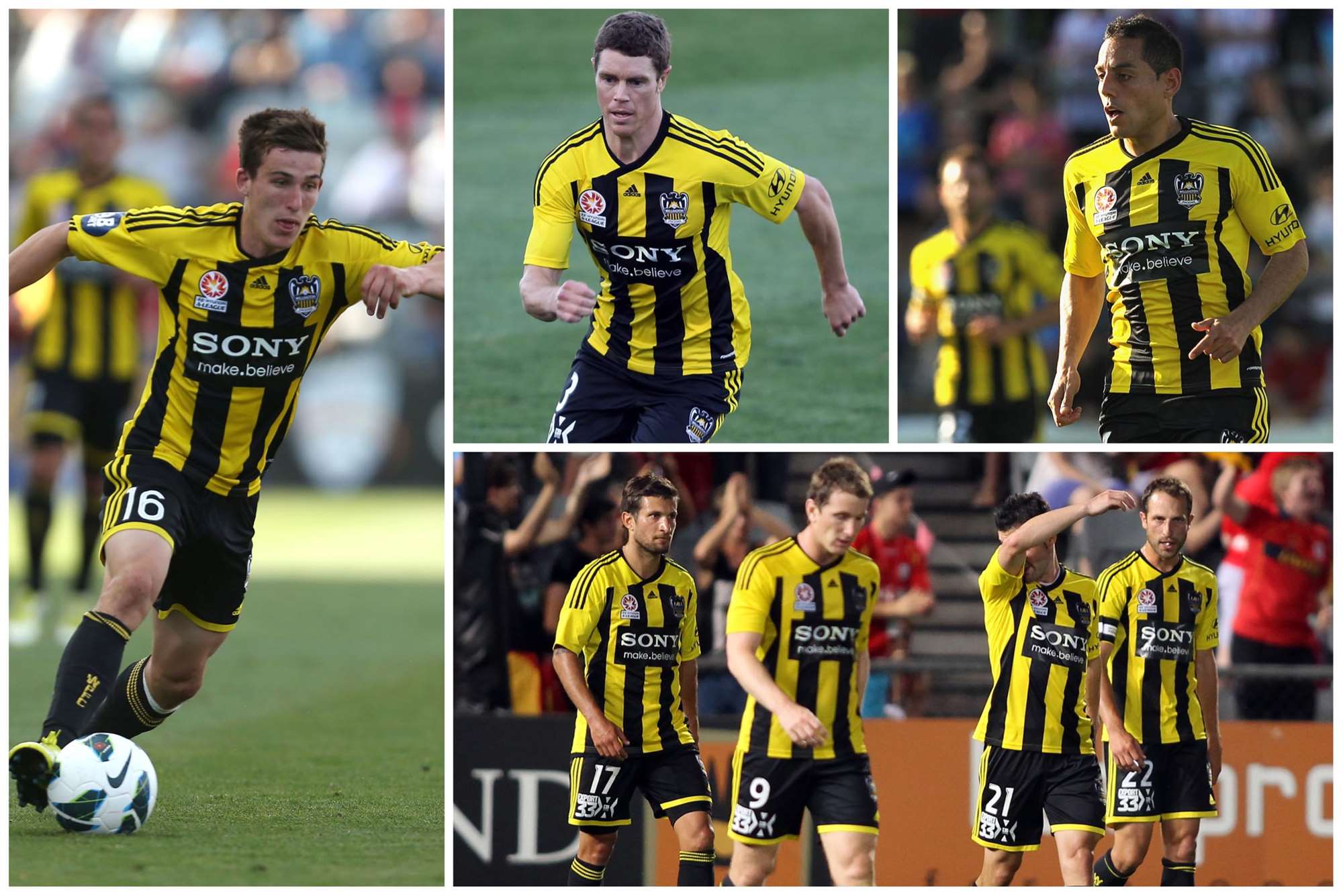
5: Phoenix home (season 8)
Stripes were non-existent in the early days of the league – thankfully that changed. Hull City fans might agree too, this updated black and gold stripe design is a winner.
7 / 10
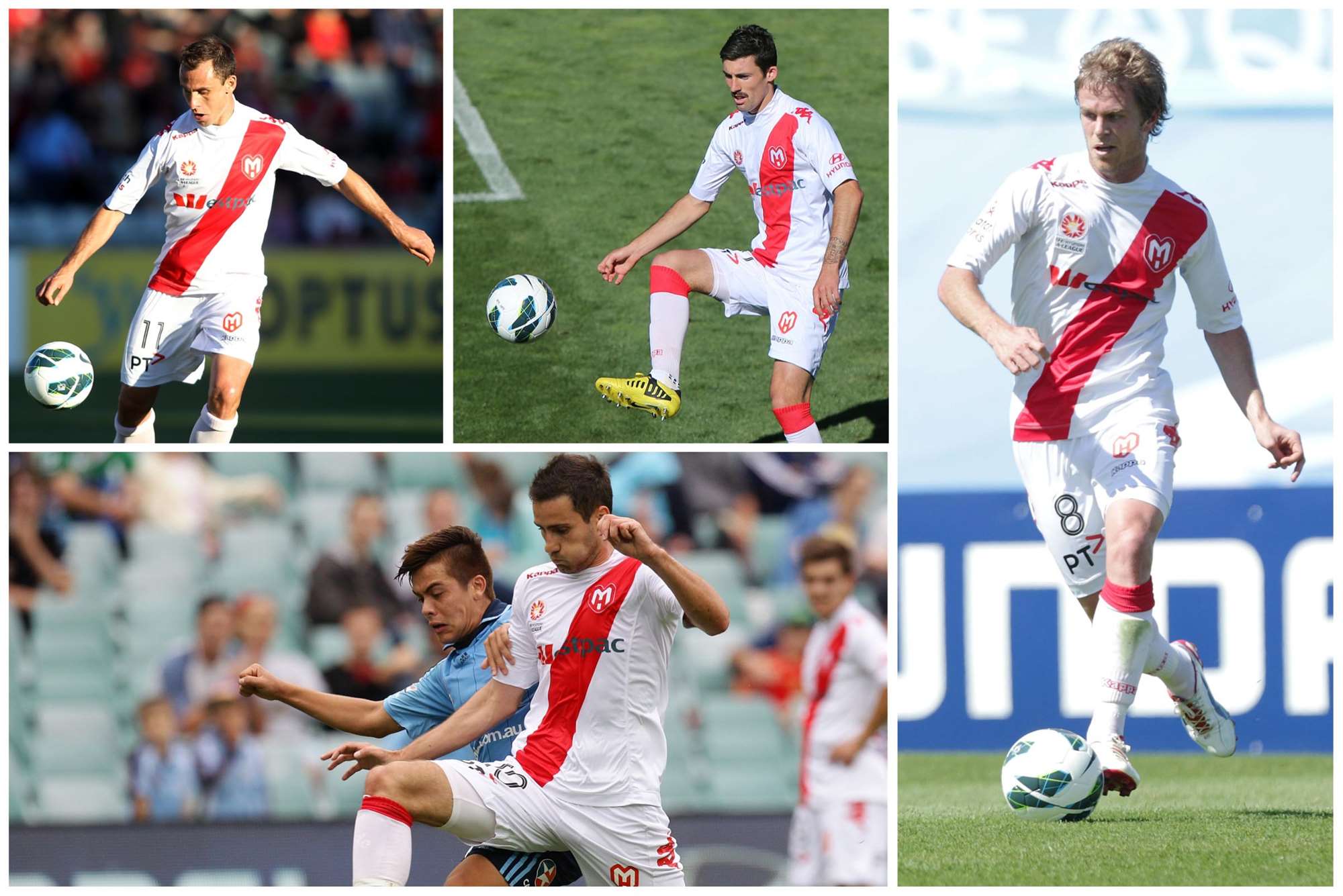
4: Melbourne Heart away (season 6-)
The red sash on white shirt was a bold statement from the new boys. And it worked.
8 / 10
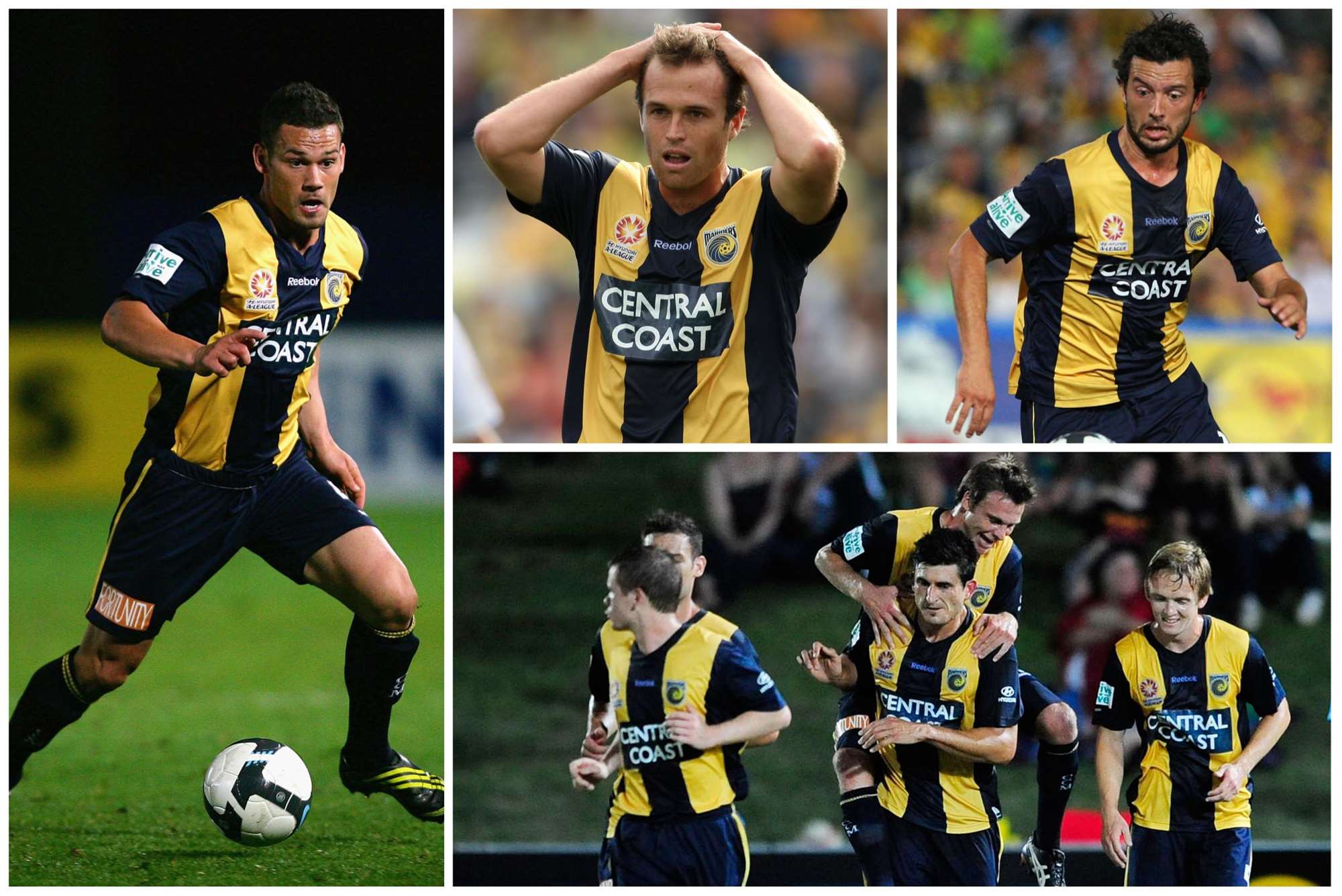
3: Central Coast Mariners (season 4)
Reebok came in for a lot of stick over their template kits but in one of their last attempts, they finally got it right with fabulous thick bold yellow and blue stripes. The follow up kit by Hummel would have been even better - if they'd just left out THAT stitching.
9 / 10
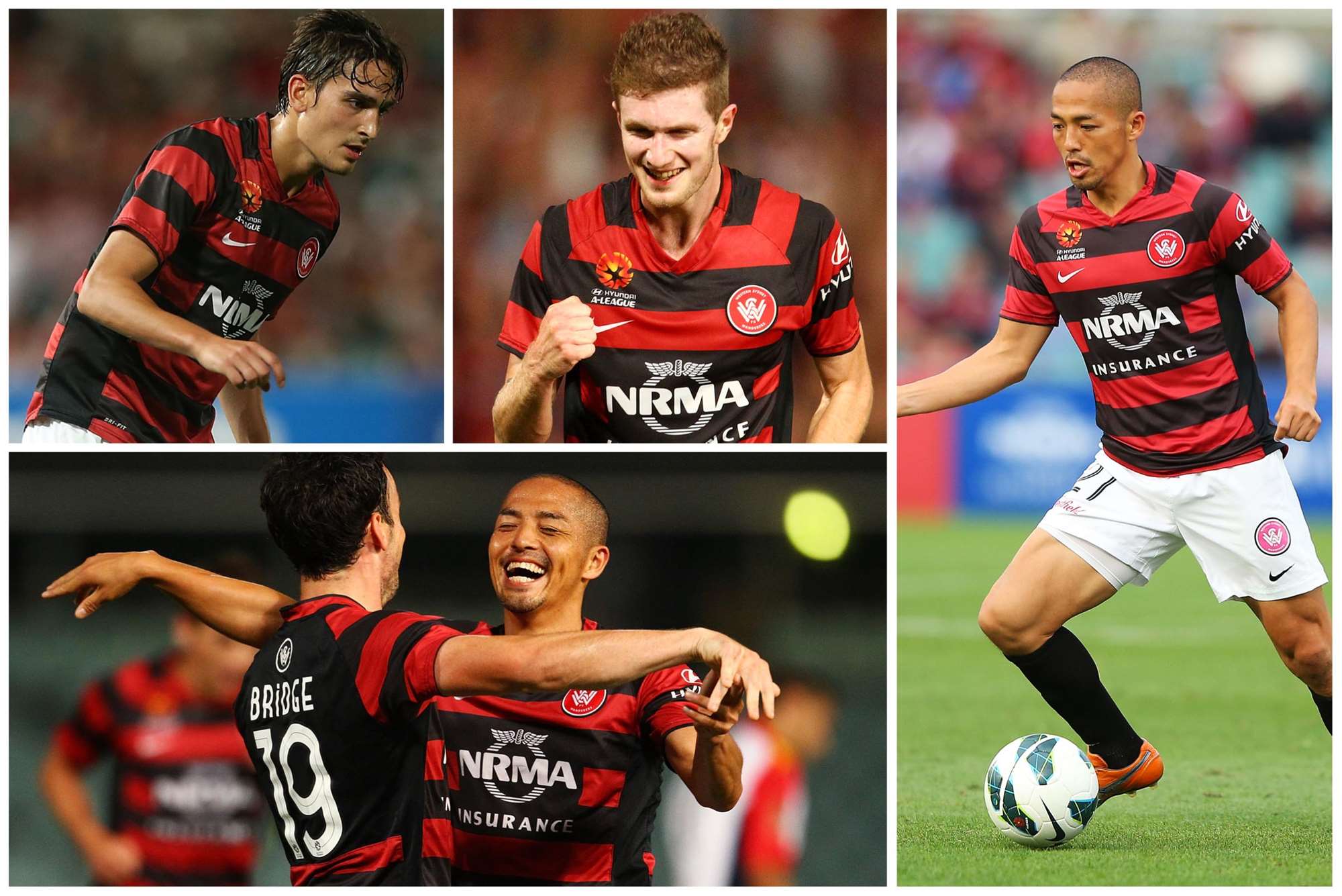
2: Wanderers home (season 8)
What happens when the fans are consulted about colours and design. It’s unique and represents the fan-base. Little wonder they sold truckloads.
10 / 10
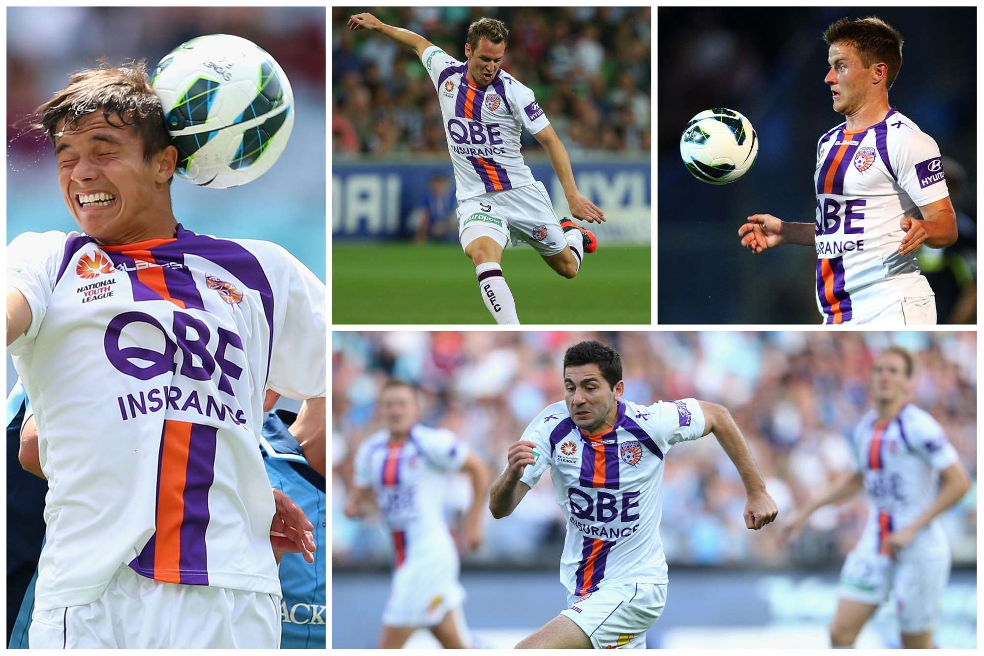
1: Perth Glory away (season 7)
A favourite of 442 online editor Kevin Airs, this design we just love - smart, stylish purple and orange stripe down the white shirt’s centre - and stuck with a winning design, but the new collar means this version is still number one.
10: Gold Coast away (season 4)
A dash of gold and blue trim on a white kit worked beautifully well. Unlike the club.
1 / 10
9: Sydney FC (away season 7)
With kits, less is more: understated colours with fewer sponsors logos often work better. Sydney’s uber-cool black away kit with sky blue trim is a prime example.
2 / 10
8: Melbourne Victory (home season 3)
After a fairly dull first few seasons, the Big V design was introduced as part of the home kit after it featured on the grey away jersey in season 2 – and the distinctive design continues to this day.
3 / 10
7: Queensland Roar (home season 1)
Orange shirt, blue shorts and maroon socks. Chad Gibson was all over this. We're tipping this season's stunning Roar third kit to feature in future classic kit lists though...
4 / 10
6: North Queensland Fury (season 4-)
Green doesn’t often get a gig in the A-League especially when it was lime green and dark green combined - and it's fair to say opinions were divided on it, not least in FourFourTwo HQ. But the Townsville club pulled it off - till the plug was pulled.
5 / 10
5: Phoenix home (season 8)
Stripes were non-existent in the early days of the league – thankfully that changed. Hull City fans might agree too, this updated black and gold stripe design is a winner.
6 / 10
4: Melbourne Heart away (season 6-)
The red sash on white shirt was a bold statement from the new boys. And it worked.
7 / 10
3: Central Coast Mariners (season 4)
Reebok came in for a lot of stick over their template kits but in one of their last attempts, they finally got it right with fabulous thick bold yellow and blue stripes. The follow up kit by Hummel would have been even better - if they'd just left out THAT stitching.
8 / 10
2: Wanderers home (season 8)
What happens when the fans are consulted about colours and design. It’s unique and represents the fan-base. Little wonder they sold truckloads.
9 / 10
1: Perth Glory away (season 7)
A favourite of 442 online editor Kevin Airs, this design we just love - smart, stylish purple and orange stripe down the white shirt’s centre - and stuck with a winning design, but the new collar means this version is still number one.
10 / 10
The A-League's best kits
By Aidan Ormond We’ve seen a few shockers, but we’ve also witnessed some stunning kits from our A-League clubs past and present. Here’s our best, ranked from ten down to numero uno…
By Aidan Ormond We’ve seen a few shockers, but we’ve also witnessed some stunning kits from our A-League clubs past and present. Here’s our best, ranked from ten down to numero uno…