The pieces of the Western United jigsaw puzzle are slowly falling into place, but do you like the finished picture?
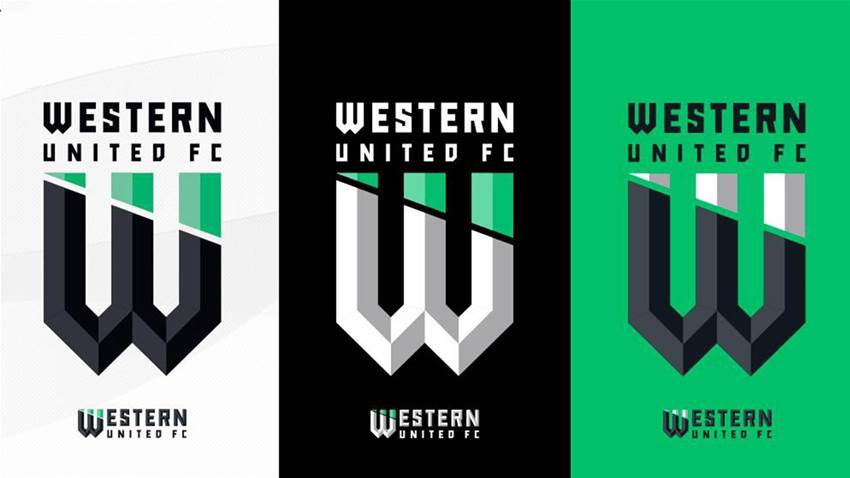
Get excited everyone: the new A-League entrants, set to enter the competition at the beginning of next season, have announced their inaugural club crest – and it's based on rooftops.
The 'W' shaped design, which was leaked online several weeks ago and is vaguely reminiscent of the Warner Brothers logo, also exhibits similar characteristics to Juventus' controversial rebranding of their own crest last year.
It follows a growing trend in football across the past two decades to forego traditional, historic designs for a minimalist approach accentuating a single key feature.
While there's a lot of rhetoric in the importance of branding - no more so than the club's claim that their colours represented the green nature reserves and black bitumen of Western Melbourne while the design was inspired by the aerial view of rooftops - enhancing visual signifiers is an importing branding exercise.
The West is Now United. https://t.co/oSFqip8Awr #wufc #westernunitedfc #theunitedwest #ALeague pic.twitter.com/1Kg4ata96p
— Western United FC (@wufcofficial) May 8, 2019
The basic idea is if you're competing in a crowded marketplace where your busy audience's senses are constantly overloaded, the more instantly recognisable your logo is and the fewer conflicting elements the eye has to deal with, the better chance you've got of gaining audience traction.
WHY DOES THIS MATTER?
There are few markets more saturated on earth than the Melbourne sporting audience. For a population of less than five million, Melbourne boasts 10 AFL clubs, two NBL clubs, three cricket clubs, an NRL club, a Super Rugby club, a netball club, and now three A-league clubs.
There are about 27 professional clubs total, with more to come, and that's just the fairly major sports.
Chuck in the Australian Open, Melbourne Cup, Grand Prix, MotoGP...Sandown...and you can see why every one-percenter you can add to give yourself a leg-up is crucial.
WHAT WUFC SAID
“We have listened to our fans and have created a brand identity which is contemporary and modern, and arguably non-traditional for a football club logo," WUFC CEO Maurice Bisetto said.
"This is our point of difference as we go about building a club for the future, not built on legacy, but reflecting a growing multicultural fan base that are very proud of their geographic Western roots."
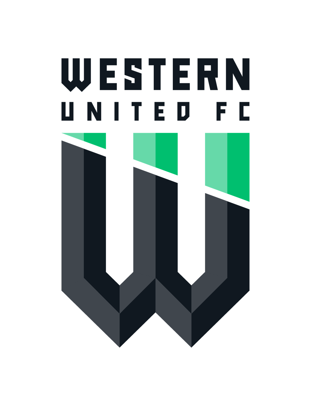
“The result is a minimalist and refreshing design which reflects the club’s bold, innovative and aspirational ambitions, both on and off the field. It’s not every day that a start-up professional sports club ventures to build its own stadium," Bisetto continued.
"We believe the logo will resonate very strongly with all stakeholders of Western United, including our players and passionate fans.”
So before you crucify Western United on social media, take a moment to consider the thousands of painstaking hours of research, eye-tracking experiments, failed attempts and sacked graphic designers that went in to forming this approach - from the McDonald's golden arches to the Juventus 'J'.
Then crucify it anyway. I mean bitumen? C'mon...
Related Articles

Socceroo-in-waiting seals Championship deal

Fringe Socceroo swerves A-League to remain in Europe after Fulham exit
