What were the designers of these uniforms thinking?
The Socceroos recently unveiled their "new and improved" kit which they will wear for 2016 and 2017. However, the fashion industry's verdict has been, well ... not great. The new kit - which features the Socceroos' iconic gold shirt, with gold shorts and green socks - has been slammed on social media, being described as anything from a "Golden Globe" to a "Golden Onesie". With this in mind, Inside Sport brings you the top ten worst kits in sporting history.
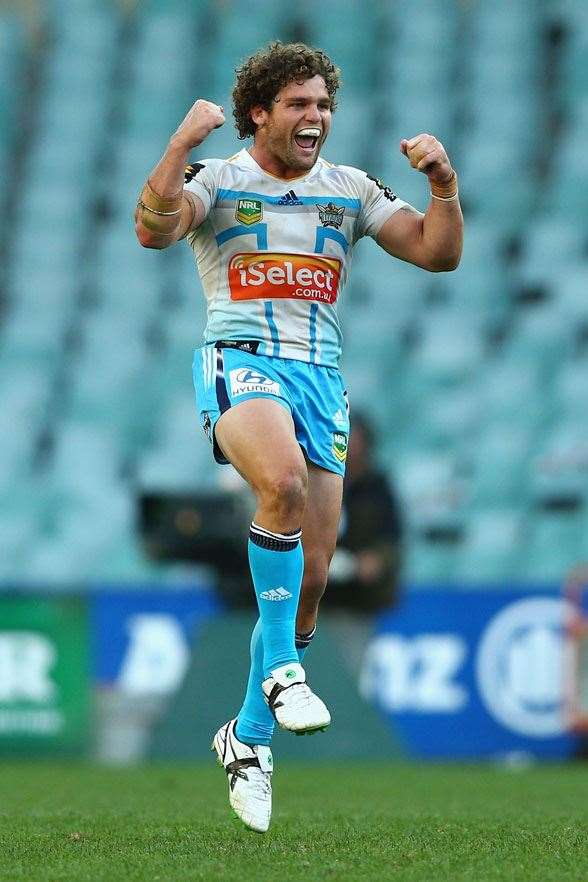
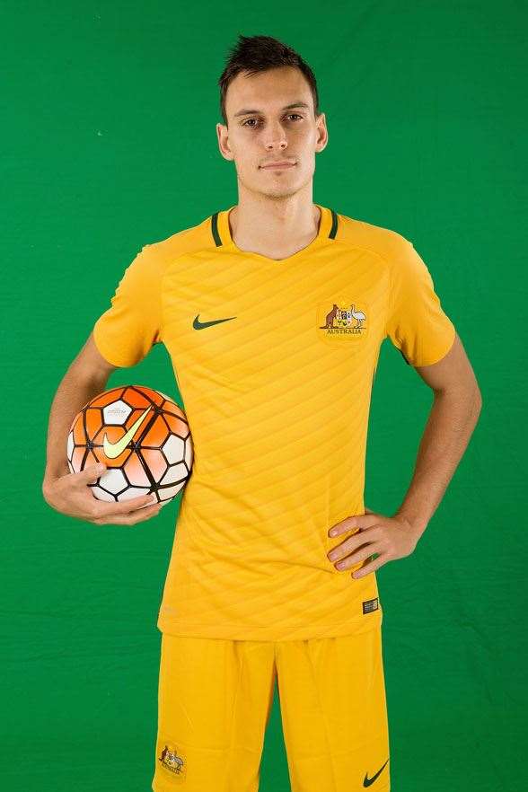 Socceroo Trent Sainsbury. (Photo by Getty Images)
10. CARLTON SELLS OUT
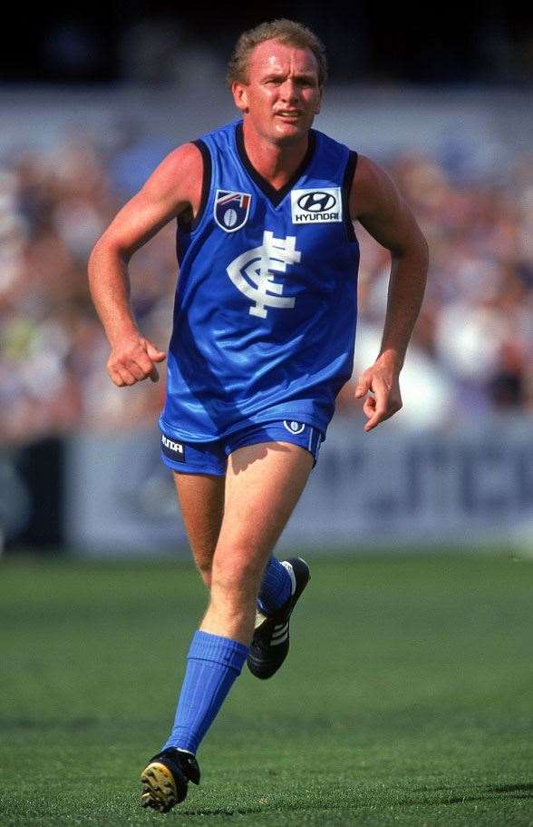 The Carlton kit, which promoted a new M&Ms colour in 1997. (Photo by Getty Images)
9. TWO BLUES
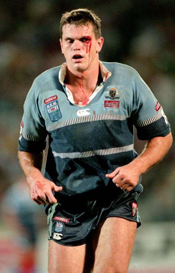 That "Two Blues" Origin jersey from 1997. (Photo by Getty Images)
8. "T" FOR TITANS
In 2013, the Gold Coast Titans thought they would try and be a little bit more creative with their jersey design. However, the Gold Coast's away kit was more reminiscent of an NFL-style helmet. As you can see, it featured a Big T across the chest that flowed down the front of the jersey. It just wasn't ... rugby league.
 The Titans' away kit for the 2013 NRL season. (Photo by Getty Images)
7. ALL BLACKS TURN GREY
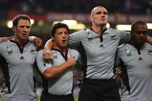 All grey-jersey donned by the All Blacks at the 2007 RWC. (Photo by Getty Images)
6. THE TABLECLOTH
Manchester United might have won their EPL title back in 2013, however they did it in the ugliest of fashion. By that we mean the kit they played in, which looked like something you'd throw over your table before dinner ...
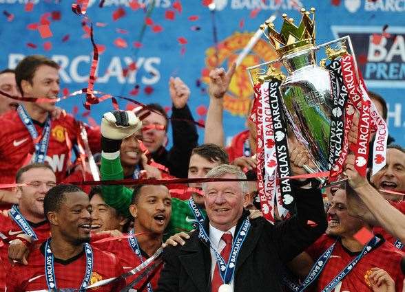 Manchester United won the EPL but not in great ... fashion. (Photo by Getty Images)
5. AQUA BRONCOS
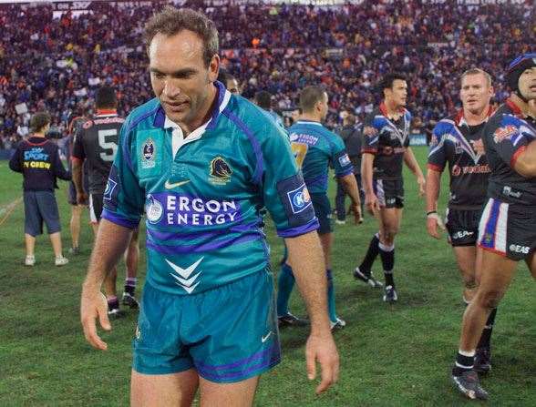 The Aqua Broncos of 2002. (Photo by Getty Images
4. SIDESHOW MARINERS
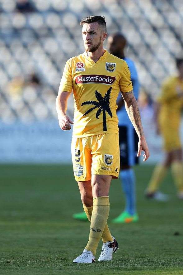 Palm Tree or Sideshow Bob? (Photo by Getty Images)
3. SOCCEROOS' SPEW SHIRT
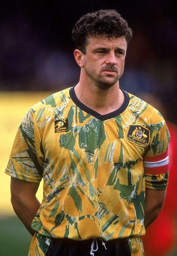 Spew kit from the Socceroos in 1993 (Photo by Getty Images
2. MANLY-WARRINGAH COW-EAGLES
 The Cow-Camo-Eagles (Photo by Getty Images)
AND THE "WINNER" IS ... JORGE CAMPOS
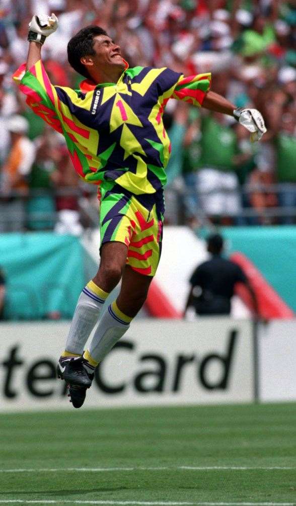 Jorge Campos designed his own jerseys. (Photo by Getty Images)
Related Articles
Champion A-League coach set to join Premier League giants
Split decision: Popovic in mix as Hajduk hunt new boss